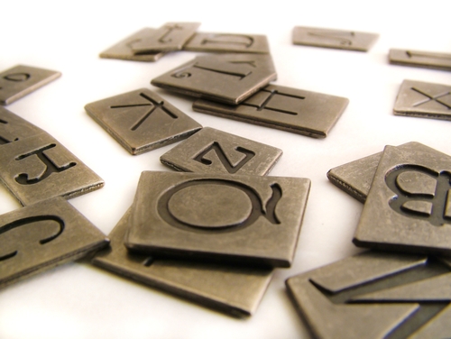
While font choice is often overlooked element when it comes to birthday cards, sympathy cards, thank you cards, etc., typography can have a big impact on the overall look and feel of a card. For instance, you would never want to choose a casual font such as Comic Sans for a sympathy card (actually, it’s probably best to stay away from that font entirely). Instead, you might want a typeface with a much more professional and elegant look, such as Dancing Script.
Understanding font and its impact starts with learning about it. I was surprised to find these fun facts about typography that can help you better utilize font in cards and letters:
Fonts have gender
That’s right, fonts can be either male or female. The male fonts are typically big, bold and heavy. As you would expect, it’s the lighter, curly fonts that are considered to be of the female persuasion. Impact, for instance, is a font that would be considered male, while Corsiva would be female.
Garamond is used in famous book series
If you open up any of the Harry Potter books or the Hunger Games series, you’ll discover that both authors used Garamond. Many publishers feel that this font is particularly easy to read, and it looks good whether the font is bolded, italicized or in all caps.
Courier is associated with data
Courier is the font that most librarians and data entry companies use because it has an educational, technological feel. Therefore, this is probably a good font for a memo, but not as much so for a birthday card.
The Declaration of Independence inspired Baskerville
Did you know that the font Baskerville was created by John Baskerville, a businessman who was inspired by the first printings of the Declaration of Independence? It was the typefaces of William Caslon, a bookbinder, that were used in the original document. Ben Franklin happened to be a big fan of the Baskerville font, and he was said to be the person who brought it over to the U.S., where the font was used for a number of different federal government documents.
Font may either help or hinder breakups
While typing an email or letter is a slightly cruel way of ending a relationship, if you’re going to do it that way, remember that font can make all the difference. Hoefler Text and Verdana both are associated with a respectful, light and optimistic feel to let your other half down easy. But if you don’t want to spur any false hope, it’s better to go with a business-like font, such as Courier.
Helvetica is used in lots of famous places
You’ve probably seen Helvetica before, as this font is used in New York’s subway system and the metro system of Washington, D.C. There are a number of big companies that also rely on Helvetica, including Target, Microsoft and McDonald’s. Helvetica is often confused with the Arial font.

