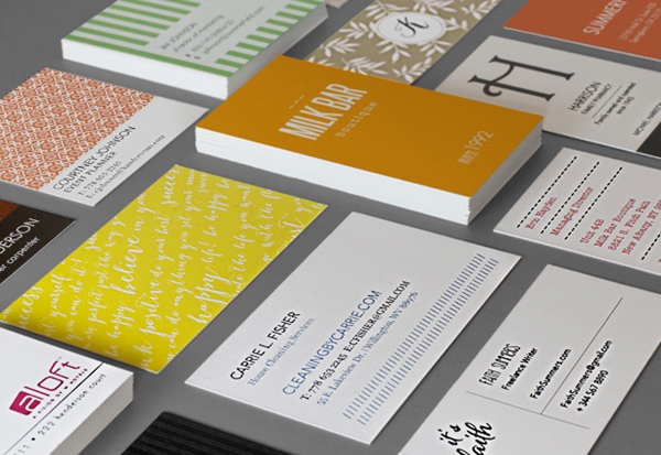
A lot of thought goes into a person’s first set of business cards. You don’t want them to be overloaded with information, but not too minimalist, either. You want them to be trendy, but not so hip that they’re out of style before you even get through a box of them. Here are a few guidelines to keep in mind when you have yours or your business’s cards designed and printed.
If they follow a theme
If you’re a small business owner, you may want your business cards – and your employee’s cards – to go along with a particular theme. This is especially true if this theme is exemplified in your other stationery, like business holiday cards and greeting cards. It’s understandable if you want the aesthetic to seem cohesive, since they’re sources of branding. If you opt to take this route, consider ordering each employee a set of his or her own business cards with your company’s logo and colors on it to ensure he or she doesn’t purchase his or her own cards through another service that doesn’t go along with the rest of the company’s cards.
“Keep your font neat, big and simple.”
Keep it simple
When you’re generating your business cards online, you may be tempted to do as much as you can with them because there are so many options! However, what seems like a good idea on screen may not translate well to the physical card. Keep your font big, neat and simple, with a limited amount of information. Include your name, job title, business email address, office phone number and company name. If space permits, you can also include either the business’s website or your own personal website, and your cellphone number. Most likely, anyone who receives this card won’t need all of these points of contact, but it’s still a good idea to provide him or her with everything he or she could need. If these cards are being designed for a whole business, including the company’s logo is advisable, but you don’t want it to be so big that it grabs all of the attention. If you want more information included than you card can handle, Hongkiat suggests adding a QR code that leads directly to your website.
Consider the field
If you’re in a creative field, like design or writing, feel free to add some color and make your business cards a little more exciting. Consult the color wheel for hues that complement each other so you don’t end up with a card that’s an eyesore. However, if you work in a more conservative field like law or business, you’ll want to keep it classic with a simple font, like Times New Roman or Cambria, in black. To make the card look a little more interesting, consider adding texture opting for an off-white shade, or embossing your lettering.

