While you’ve always loved those soft pinks, pearly whites and delicate creams, a pop of color will make your wedding stand out a bit more. The key is to map out your wedding before you commit to a color palette. A lot of your inspiration will come from the season and venue where you’re tying the knot; also, think of the mood you’re aiming for.
For instance, if you’re getting married in spring or summer, perhaps you’ll want something playful and vibrant. Or if your wedding isn’t until fall or winter, maybe you’re looking for something deeper like rich jewel tones.
Here are two steps to choosing your color combinations:
1. Consider the season
It’s important to think seasonally in terms of choosing the color scheme for your big day. To highlight the season, you’ll want to consider hues and tones that are reflective of the time of year. For a spring wedding, blush pastel colors like pinks and peaches are great. For fall, go with rich, dramatic jewel tones like reds, greens and blues. Consult the trusty color wheel if you aren’t sure where to begin. Create contrast by pairing a saturated color with a neutral one like violet and gray. The brighter color should be used as an accent, while the neutral one creates subtlety and tones it down a bit.
2. Plan around the venue
If you already have your color palette in mind, choosing a venue may be difficult, so consider scooping out the location first. Or, if you are 100 percent set on the venue and have an open mind, switch up some of the tones to better match with the carpet and wall decor. Your chosen location helps provide color inspiration. If you’re having a destination wedding and getting married with your toes in the sand, go with beach tones like blue, green and cream. By altering your colors so that they complement the venue, you’ll be able to completely avoid a clashing color scheme. If you’re absolutely in love with your colors and can’t picture your wedding any other way, choose a neutral venue that won’t be affected by awkward coloring. Typically, your rustic venues like converted warehouses, lofts and tents are fair game for any color scheme.
Now that we’ve covered the process of how to choose the color scheme, let’s cover tones that pair well together.
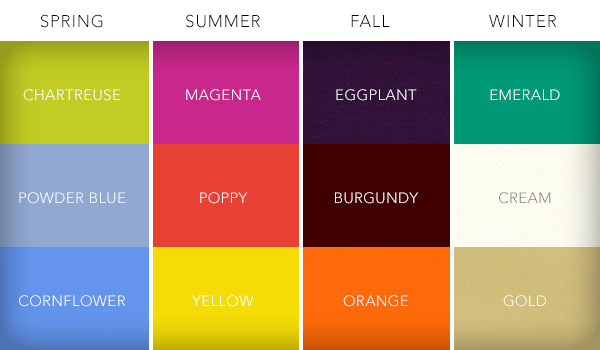
Here are four seasonal color pairings to make your wedding pop:
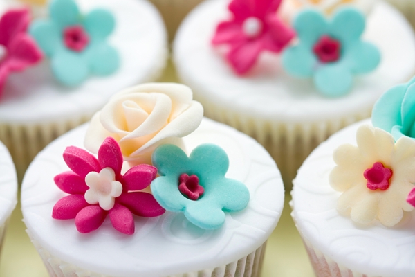
Remember: Your color palette should be uniform across all elements – this means your bridesmaid’s dresses, flowers, venue decorations, centerpieces and even your wedding invitations. This counts for your save the dates and thank you cards as well.
1. Spring: Chartreuse, powder blue, cornflower blue
The main colors here are the two shades of blue, leaving chartreuse as the accent color. These tones are perfect for a charming backyard spring wedding.
2. Summer: Magenta, poppy, yellow
For a summer wedding, opt for vibrant tones like magenta, poppy and yellow. These fresh colors will make your bouquets and floral centerpieces stand out and bring cheer to your tables.
3. Fall: Eggplant, burgundy, orange
These exquisite, deep tones are perfect if you’re tying the knot in the fall. Eggplant, burgundy and orange are romantic and exude an intimate mood.
4. Winter: Emerald, cream, gold
For a winter wedding, a whimsical jewel tone should be the main color in your palette, accented with a subtle tone like cream. For an elegant aesthetic, incorporate a shimmery gold into the color scheme. This can be reflected on your cake, table cloths, or extra embellishment for your floral arrangements and bouquets.